Cool Ways to Visualize Uncertainty
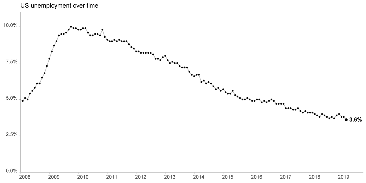
A tweet came across my feed about an article in Scientific American about visualizing uncertainty a while back. I noticed it because it was authored by a Professor from Northwestern University. I finally got around to looking for the Professor tonight. Her name is Jessica Hullman. Quite a bit of the information and papers are pretty dense as you might expect. But she also has a blog, and in one article there were some cool techniques to visualize uncertainty in unemployment data. From her blog post, here is how unemployment data is typically presented:

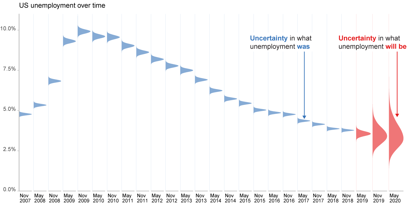
She takes the same data and gives several different versions that help show the uncertainty around each of the data points. Here is my favorite:
