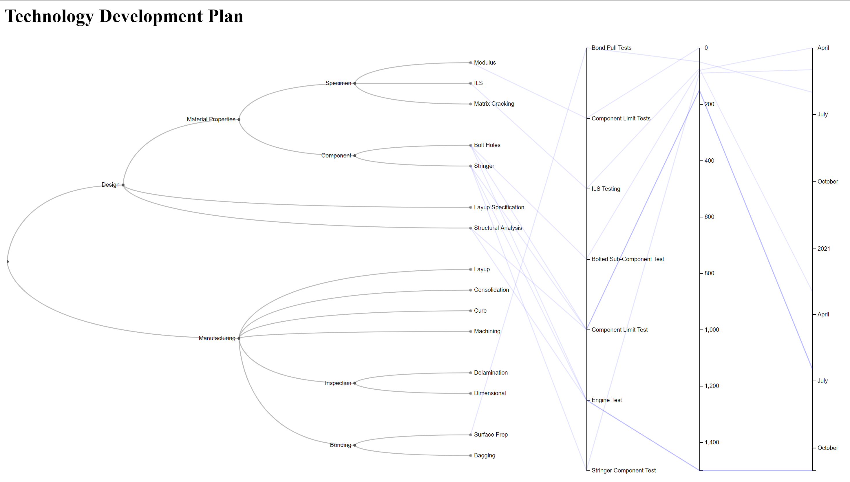
Visual Technology Roadmap

I’m currently working on a large technology development program at work. Before we put the technology in our engines, there is a lot of testing and validation that will need to be completed. The many millions of dollars worth of tests are significant and there is justifiable pressure to make sure that it is being well executed. It’s difficult to document and communicate a plan that spends large amounts of money, over many years, with a lot of different teams of people. There are different approaches. One is to write out your plan in a document. But it is almost 2020 and no one reads anything that can’t fit on a few Power Point slides. In fairness, while I think writing a document plan is a good thing to do, I’m not sure a well written document alone is enough. Reading the document through once may give a great overview, and it is a good place to get the fine details of the plan you may need. But it can take a long time to read through a good document, and there are many times when you may need to quickly refresh yourself or others on the overall plan and re-reading or scanning the document again isn’t practical.
Another approach is to use a requirements management tool like to make the connection between requirements and the testing to show compliance to those requirements. A tool commonly used in Aerospace is DOORS. Maybe others have figured out how to effectively use DOORS or other programs like it, but I don’t think I can overstate how much I dislike DOORS. DOORS presumes that our minds work just like a computer. DOORs asks users to create a linked, hierarchical system of requirements and then presumes that people can ingest the information encoded in them as if they were a software compiler. We know people minds don’t work like that. People don’t think in strict, rules based logic that computers excel at and that DOORS caters to. People relate to stories and excel at seeing patterns. Data presented visually is much easier to comprehend and learn from that raw numbers.
I continue to be interested in the power of new tools for data presentation to find new ways to communicate. Something besides the traditional document, or data formats that treat people like they were machines. The figure at the top of this post was created using a D3 script. It depicts a generic technology development plan for an organic matric composite part. For my actual work, I have created a much more detailed version. Interaction is an important feature of today’s graphic representations. I’ve posted a the same work at this site this site on the site ObservableHQ where the interactive features of the graphic can be seen. The raw code is also available on my Github site. I’ve just started using this at work, we’ll see how it goes….